BREAKFAST TO DIE FOR
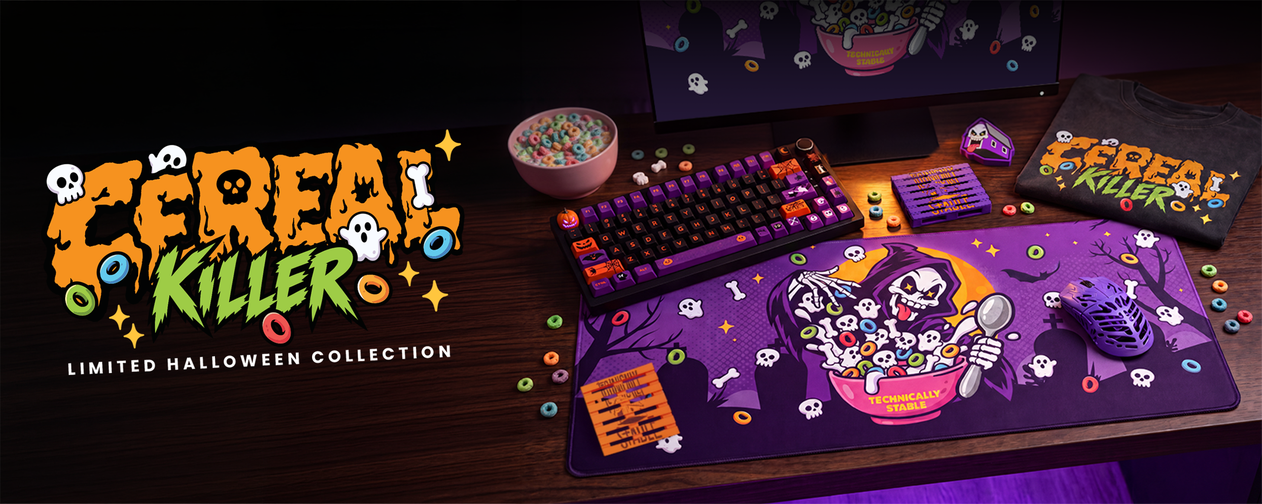
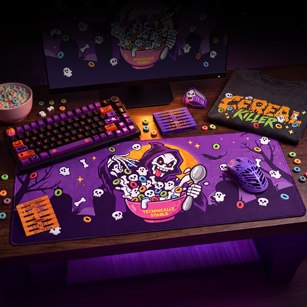
One mischievous Grim Reaper and a bowl full of strange cereal became the starting point for an entire Halloween merchandise collection. From the illustrated desk mat and graphic T-shirt to the matching accessories, each piece was designed to feel part of the same playful, slightly sinister world.
TRICK OR TWEAK
The challenge was to carry one distinctive Halloween identity across products with completely different proportions. Each composition, lettering treatment and supporting detail needed to suit its format—not simply be resized.
MEET THE REAPER
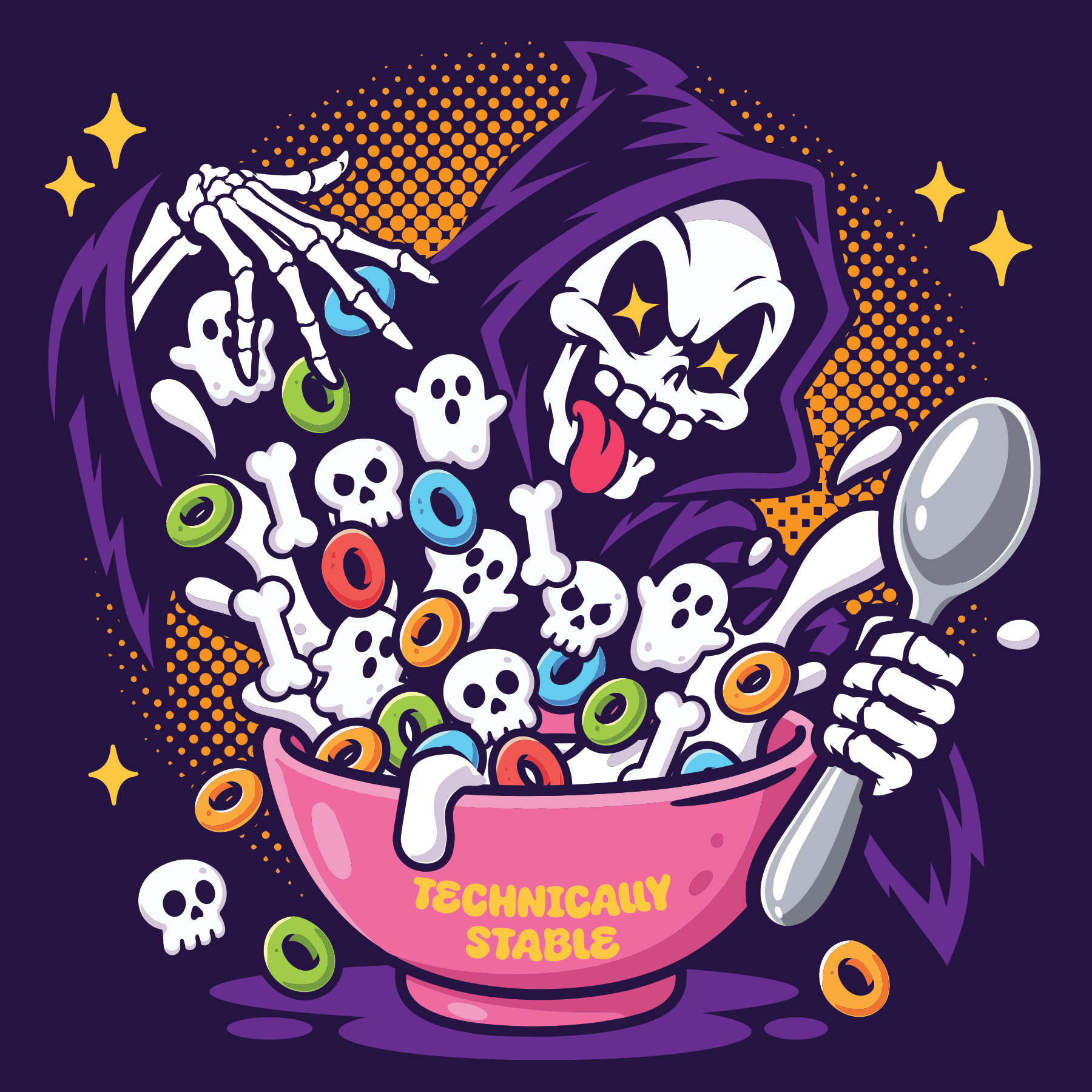
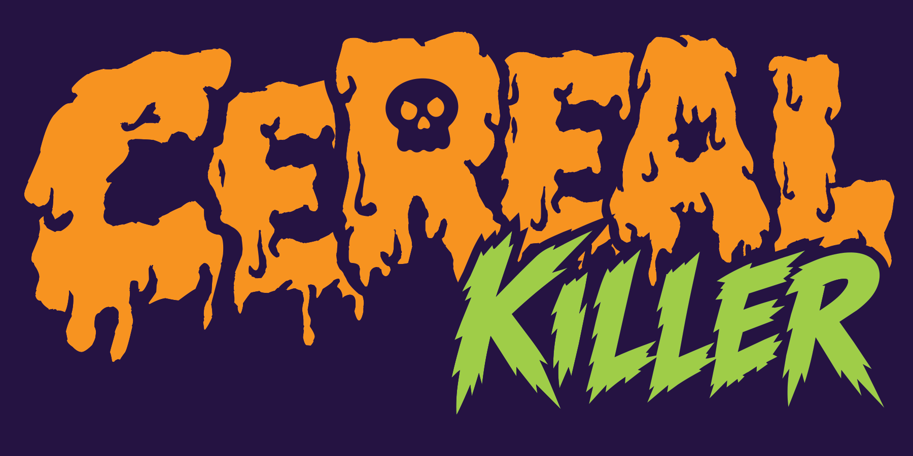
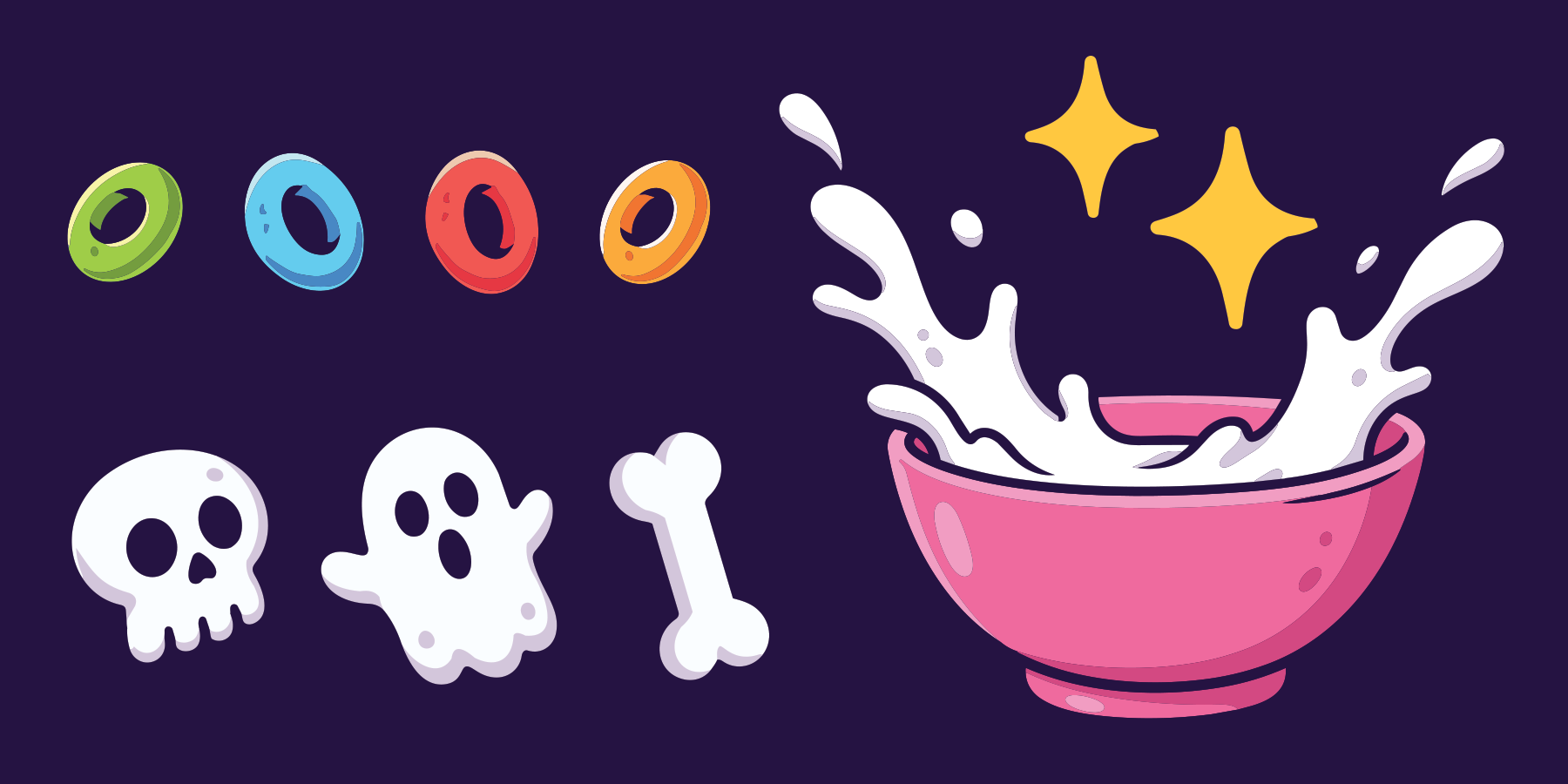
Built around a mischievous Grim Reaper, the artwork mixes spooky details with bold, colourful illustration. Custom lettering, cereal loops, skulls, ghosts and bones give the collection a distinct personality across every product.
BRINGING ART TO LIFE
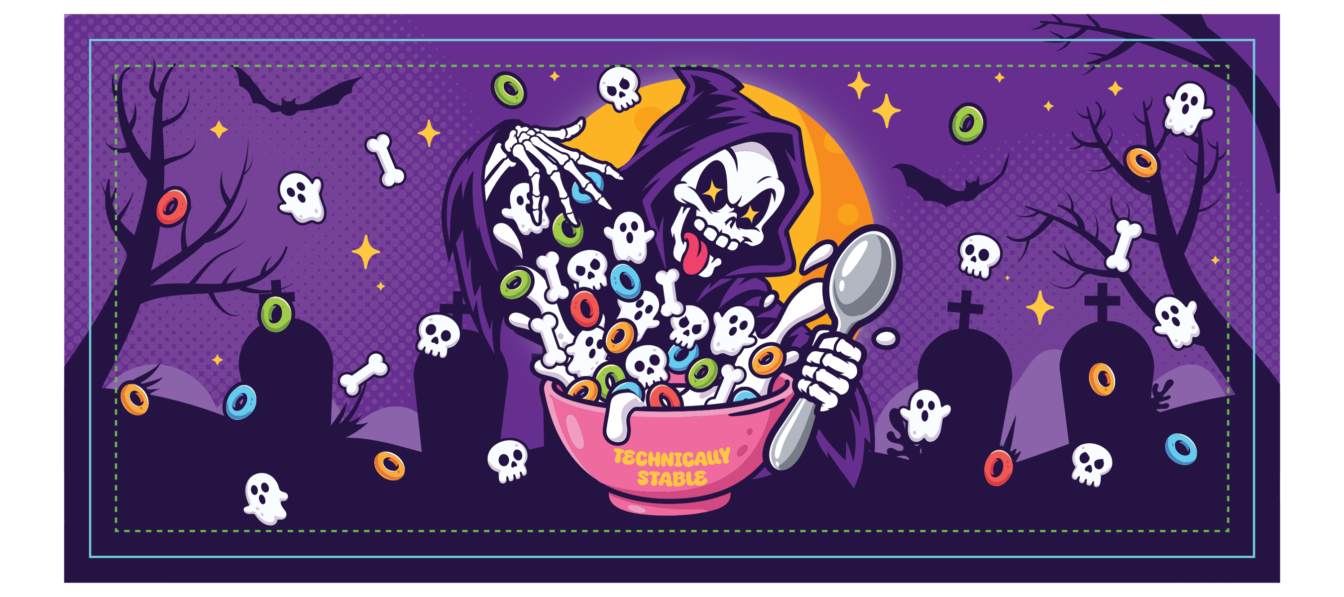
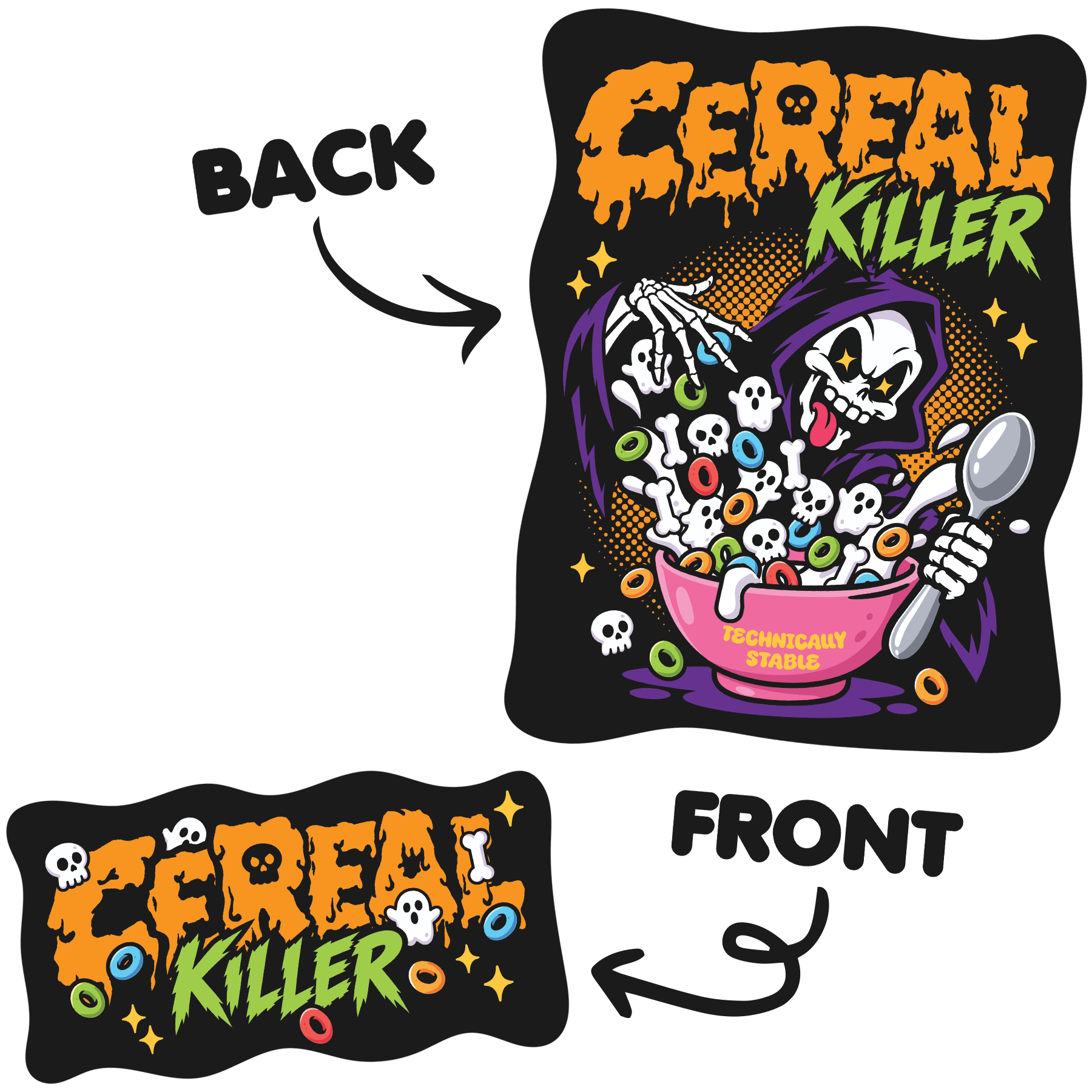
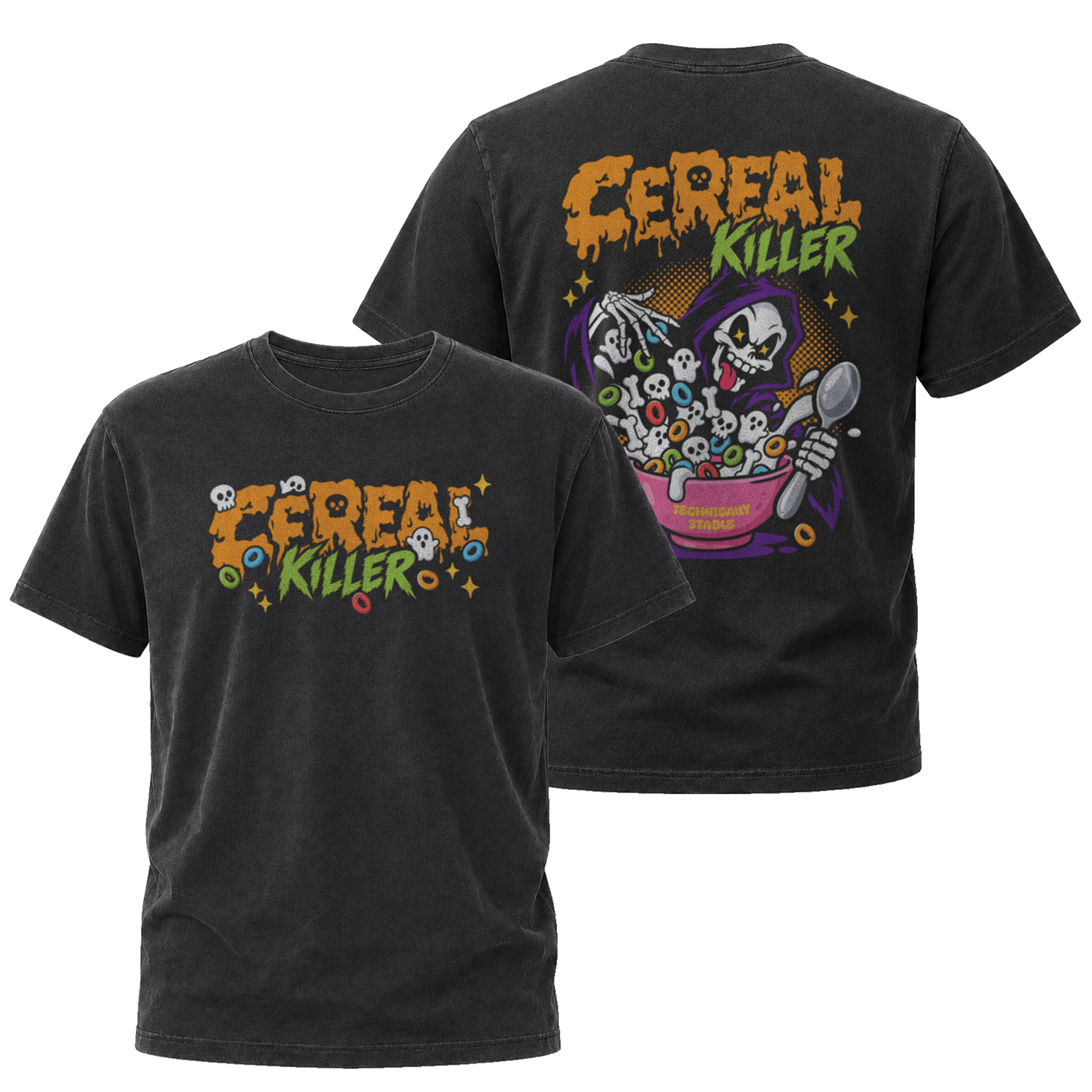
The artwork had to do more than look good on screen. I adapted its composition, scale and colours for two different production methods: sublimation for the desk mat and DTF printing for the T-shirt. Each finished product needed its own considered layout while still feeling part of the same Halloween collection.
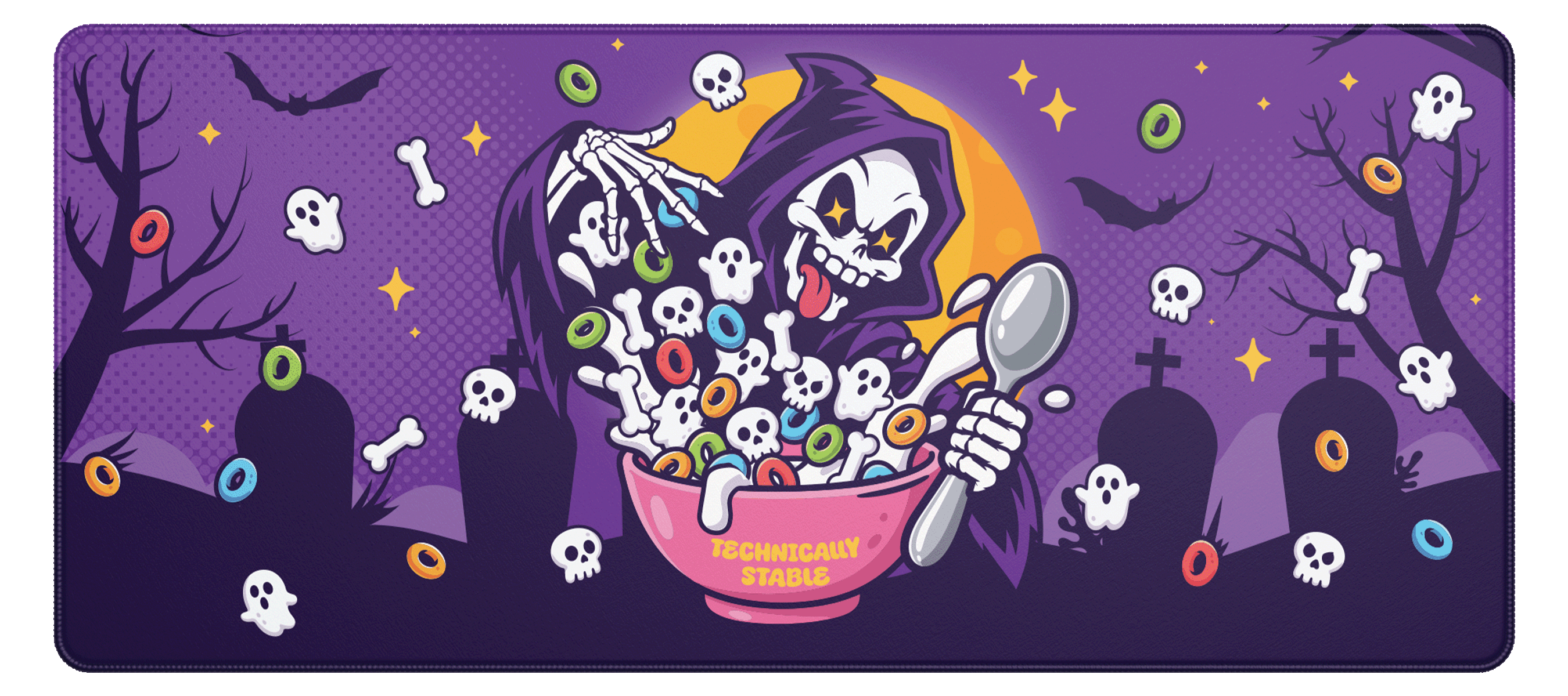
THE DESK MAT
The 900 × 400 mm desk mat gave the illustration a wide canvas. I adjusted the layout to make the character, lettering and smaller details work together across the full surface.
WEAR YOUR BREAKFAST
For the T-shirt, the artwork became a statement back print with a smaller front-chest graphic. Both placements were considered separately to suit the garment and DTF print process.
SMALL BUT FRIGHTY
The Halloween collection extended into 3D-printed desk accessories, combining my Grim Clicker character artwork with a sourced pumpkin keycap and the brand’s existing pallet coasters, recoloured for the drop. Three different products, brought together by one playful visual identity.
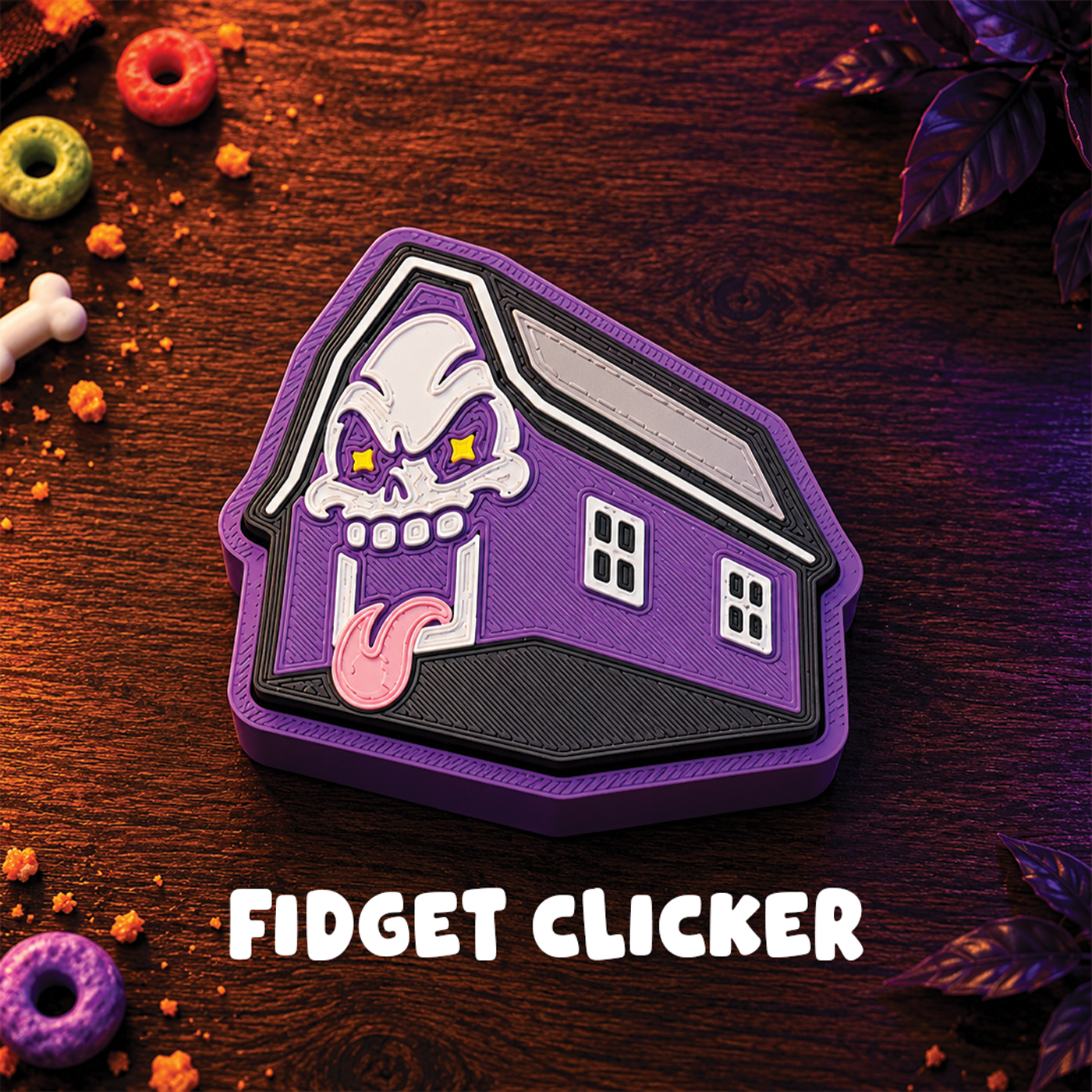
GRIM CLICKER
My Grim Reaper artwork adapted for a 3D-printed clicker
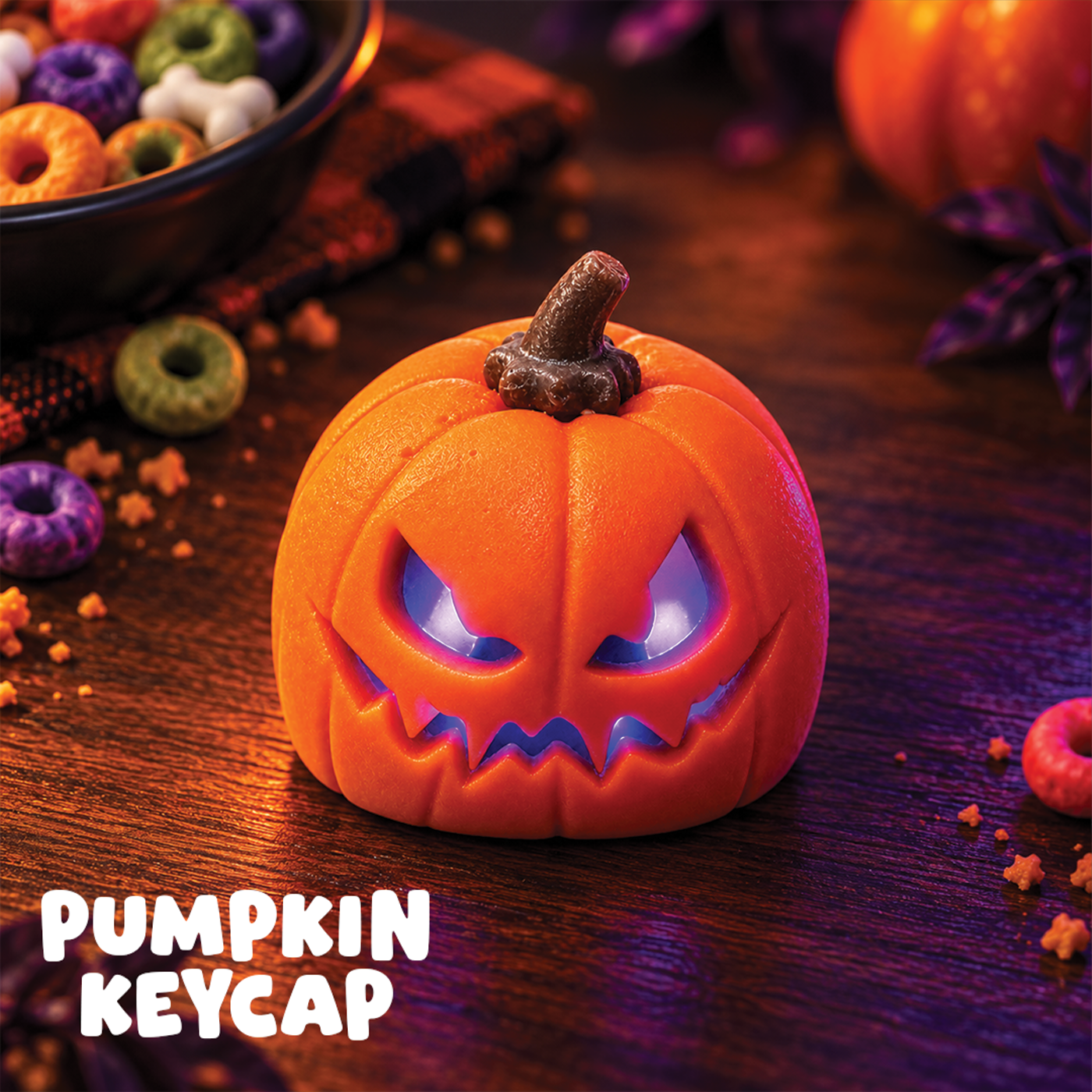
PUMPKIN KEYCAP
Sourced 3D-printed keycap chosen for the Halloween collection
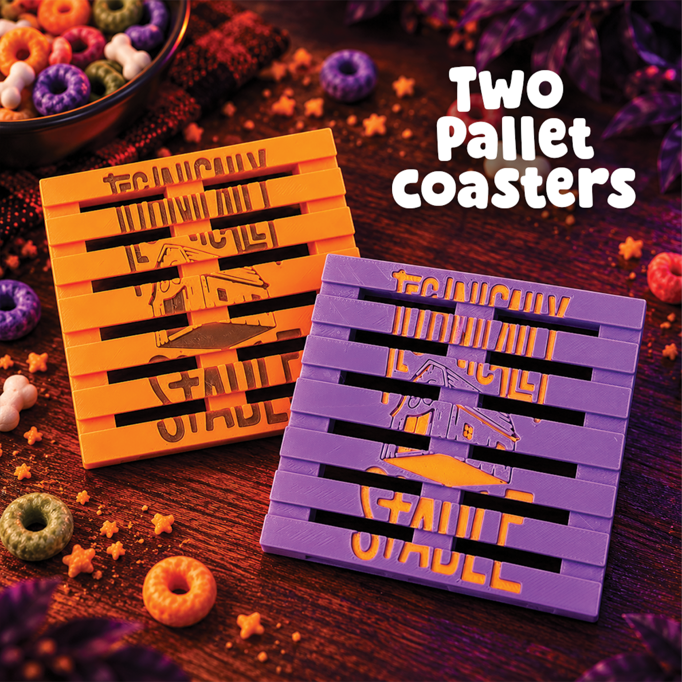
PALLET COASTERS
Existing 3D-printed coasters refreshed in the collection colours
SHARE THE SCARE
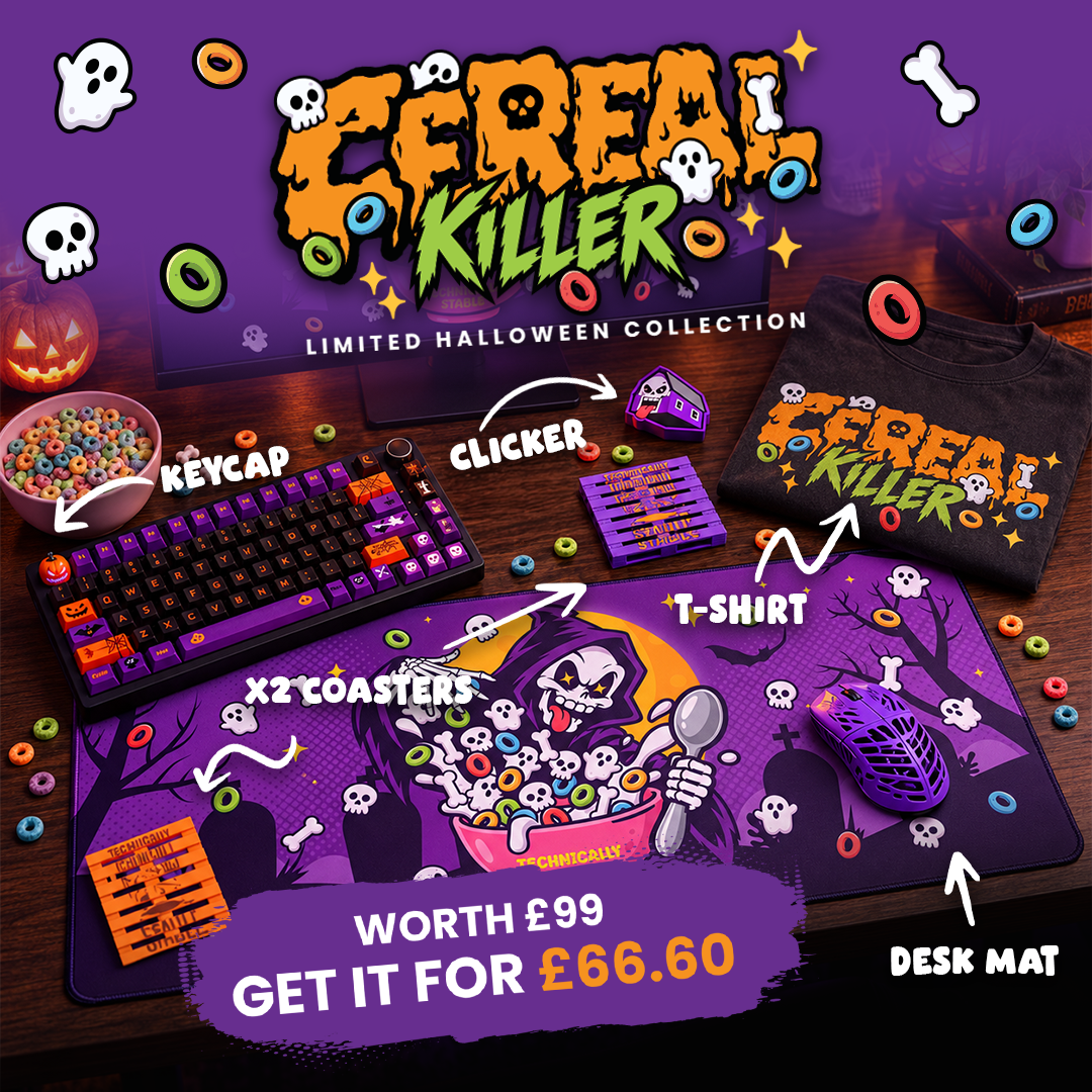
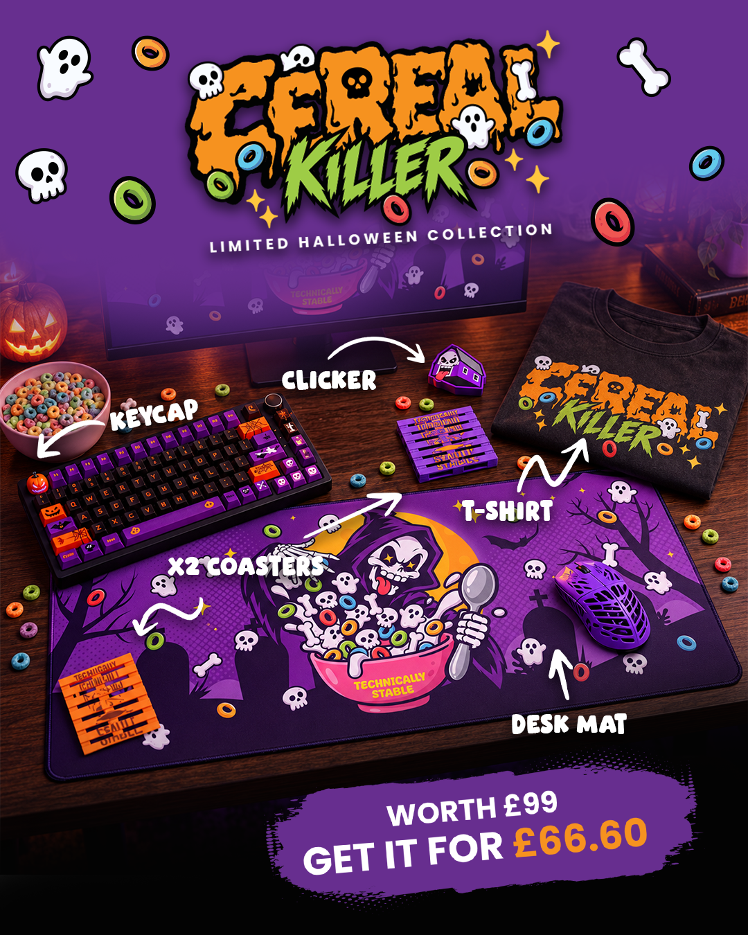
The collection needed a campaign as distinctive as the products. I adapted the Cereal Killer identity into social posts and a Klaviyo email, keeping the same bold illustration, Halloween colours and playful attitude across every format.
THE SOCIAL DROP
One concept, adapted for square and portrait feed placements while keeping the product range and launch offer in focus.
SPECIAL SCARE DELIVERY
The launch email brought the Cereal Killer personality into the inbox, introducing the limited-edition collection through bold artwork and a clear product offer. I carried the same Halloween colours, character details and playful tone from the social campaign into Klaviyo, while making sure the key message and call to action stayed easy to follow.
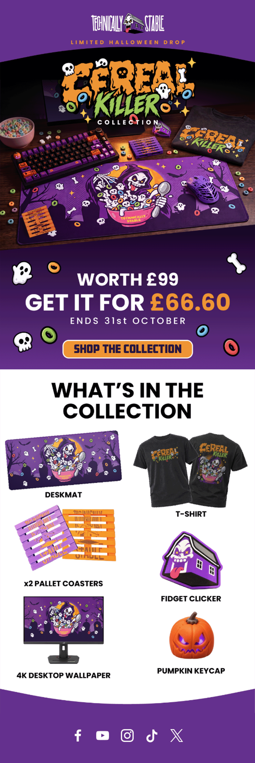
The launch message carried the collection’s playful Halloween personality into the inbox, connecting the product story with the limited-time bundle offer.
273 unique clicks · 89% above the median click rate of seven comparable recent emails · Initial results, 14 October 2026
ONE KILLER IDEA
Cereal Killer started with one mischievous illustration and grew into a complete Halloween collection. Across desk mats, apparel, accessories, social creative and email, I brought character design, practical production considerations and consistent visual storytelling together—making every piece feel part of the same distinctive drop.
← SEE MORE STUFF